Yanck
Yanck
Construction and Developer
Construction and Developer
Construction and Developer
Services:
Services:
Services:
Visual Identity
Visual Identity
Visual Identity
Local:
Local:
Local:
Telemarco Borba - PR
Telemarco Borba - PR
Telemarco Borba - PR
Data:
Data:
Data:
May, 2022
May, 2022
May, 2022
Direction:
Direction:
Direction:
Lucas Massaneiro
Lucas Massaneiro
Lucas Massaneiro
About
About
About
About
Design
Design
Design
Design
Lucas Massaneiro
Lucas Massaneiro
Lucas Massaneiro
Strategy
Strategy
Strategy
Strategy
Lucas Massaneiro
Lucas Massaneiro
Lucas Massaneiro
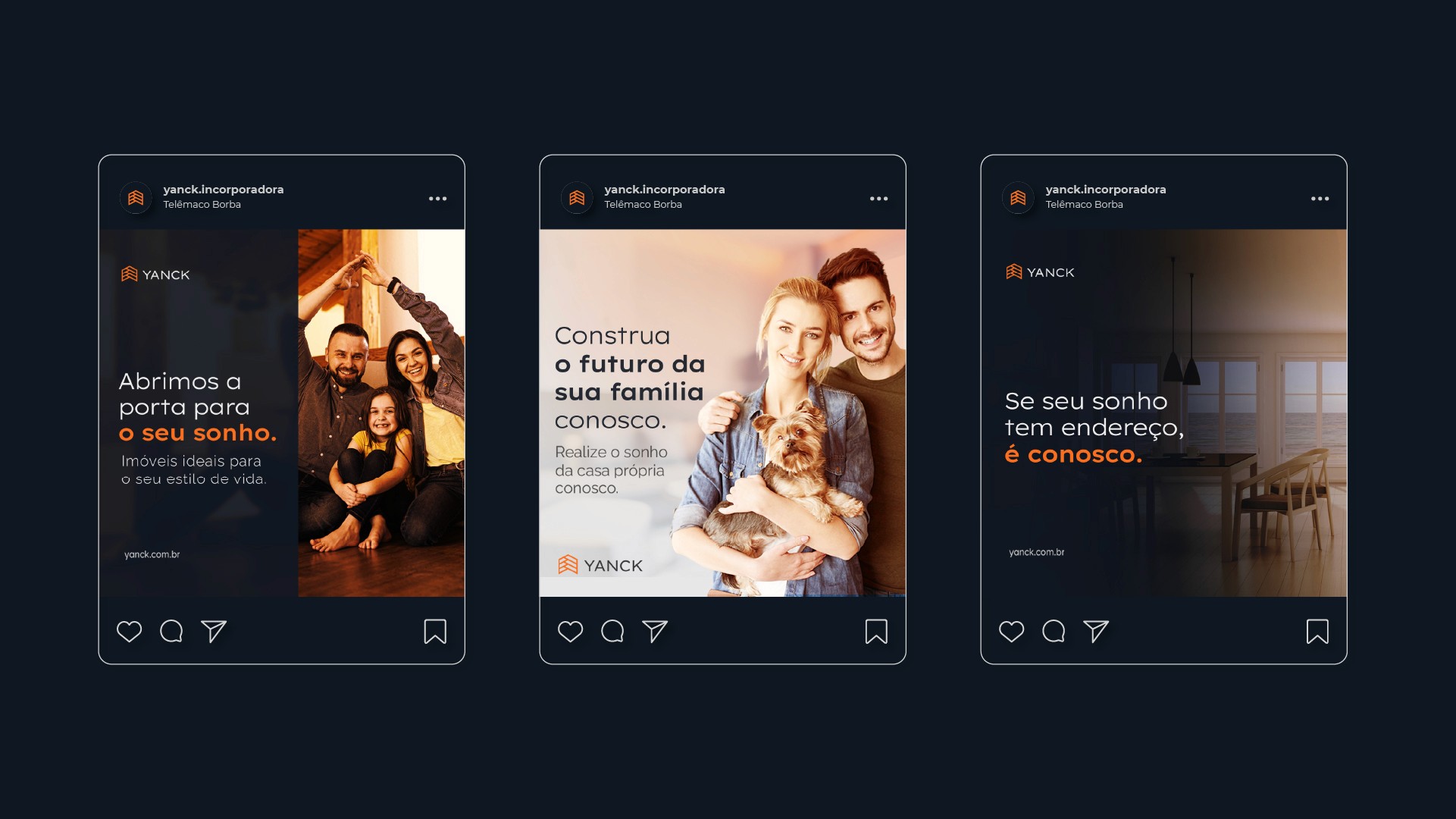
Yanck is a company dedicated to establishing itself as a reference in the construction sector, standing out for its constant pursuit of quality and innovation in its services. With a firm commitment to delivering excellent projects, the company has a highly qualified team, prepared to transform its clients' dreams into reality efficiently and personally.
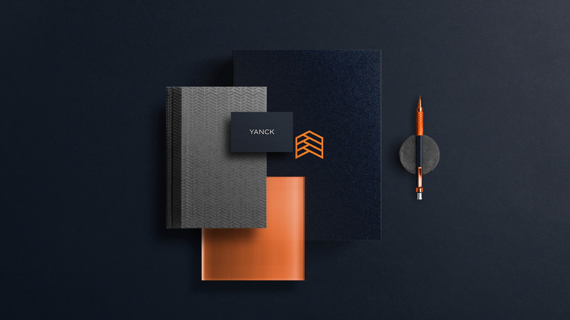
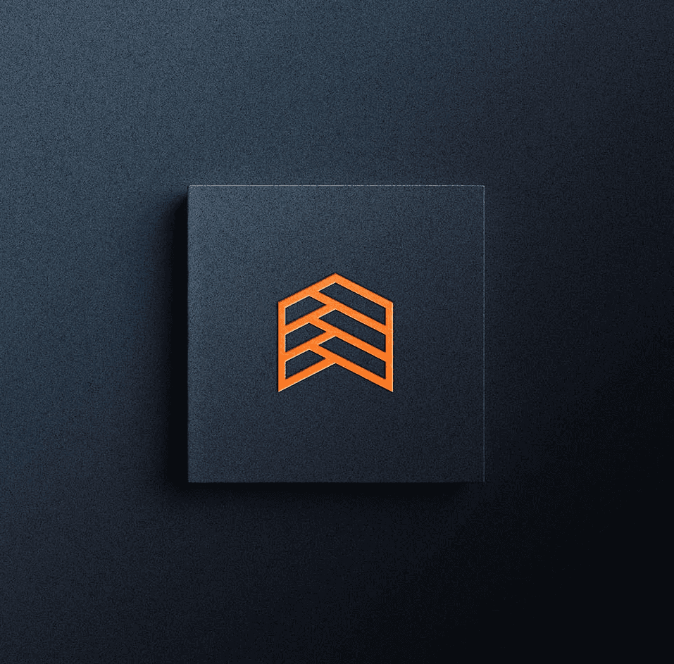
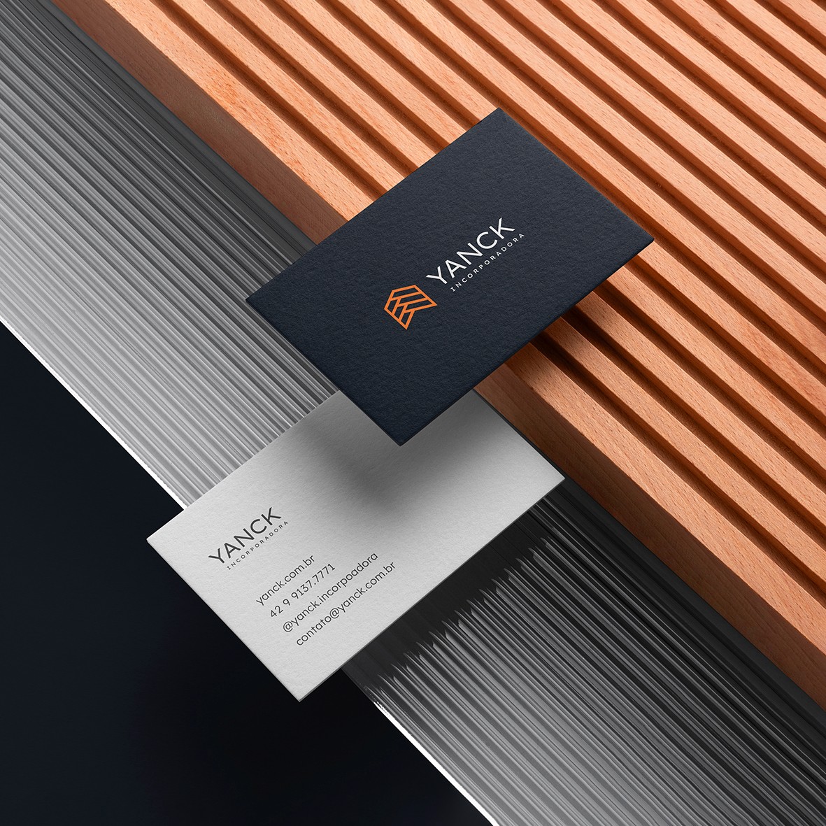
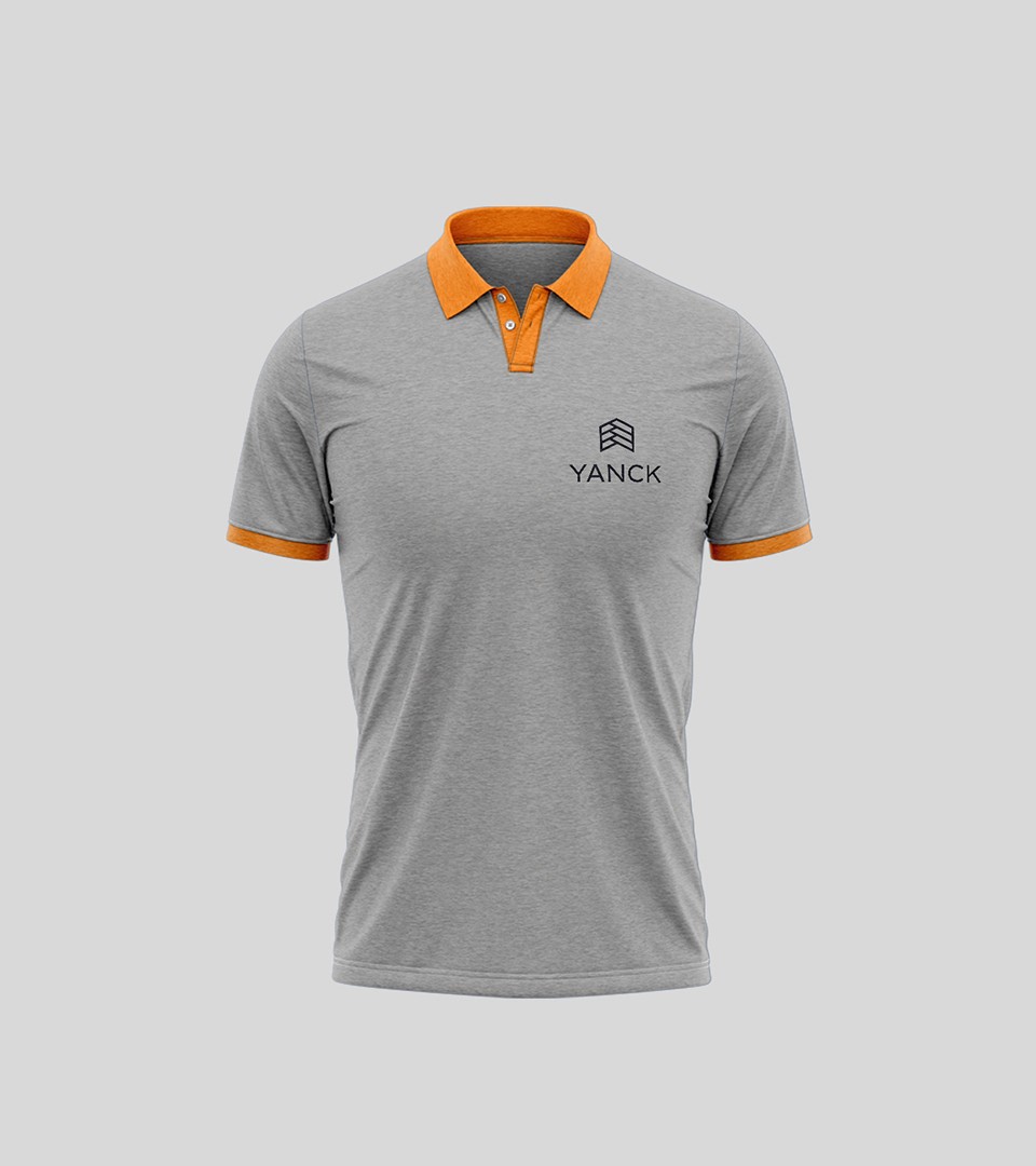
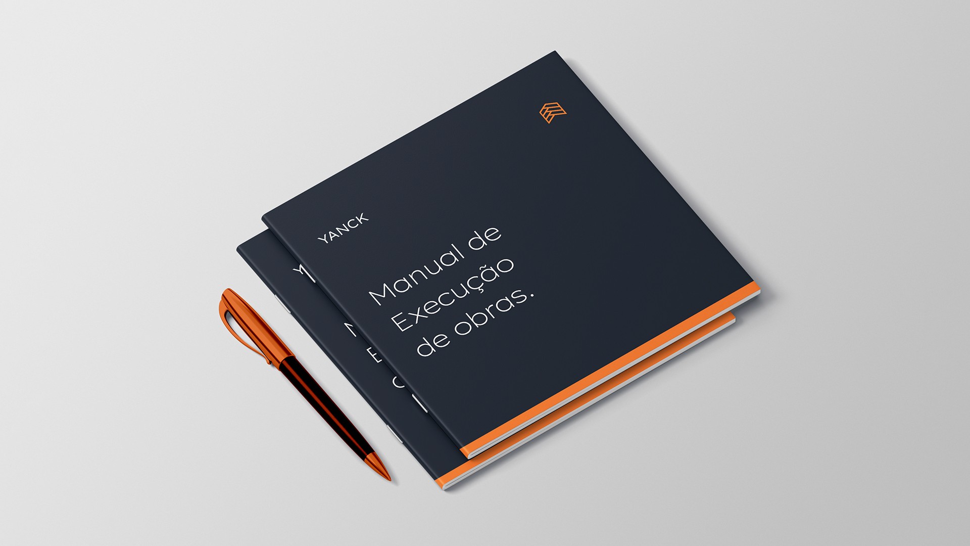
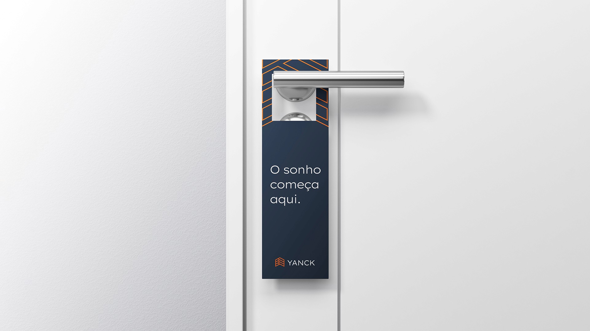
Based on these principles, the brand's visual identity was conceived to reflect a modern and sophisticated personality. The Yanck symbol was developed from a modular grid, representing a building and incorporating the letter "Y" in the form of ascending arrows. This design reinforces the values of growth, construction, and the realization of dreams that the company seeks to convey.
To complement this identity, carefully selected typefaces were chosen to communicate elegance, professionalism, and the trust that Yanck's clients deserve. Thus, the brand presents itself as a reflection of its mission and values, aligned with the expectations of a demanding and constantly evolving market.
Yanck is a company dedicated to establishing itself as a reference in the construction sector, standing out for its constant pursuit of quality and innovation in its services. With a firm commitment to delivering excellent projects, the company has a highly qualified team, prepared to transform its clients' dreams into reality efficiently and personally.
Based on these principles, the brand's visual identity was conceived to reflect a modern and sophisticated personality. The Yanck symbol was developed from a modular grid, representing a building and incorporating the letter "Y" in the form of ascending arrows. This design reinforces the values of growth, construction, and the realization of dreams that the company seeks to convey.
To complement this identity, carefully selected typefaces were chosen to communicate elegance, professionalism, and the trust that Yanck's clients deserve. Thus, the brand presents itself as a reflection of its mission and values, aligned with the expectations of a demanding and constantly evolving market.


Let's make your brand stronger?
Let's make your brand stronger?
Discover how the studio's consulting can help
your business grow and earn more
Discover how the studio's consulting can help
your business grow and earn more
Discover how the studio's consulting can help
your business grow and earn more
Discover how the studio's consulting can help
your business grow and earn more