GRUPPI
GRUPPI
GRUPPI
GRUPPI
Digital Finance
Digital Finance
Digital Finance
Services:
Services:
Services:
Visual Identity
Visual Identity
Visual Identity
Local:
Local:
Local:
Belo Horizonte - MG
Belo Horizonte - MG
Belo Horizonte - MG
Date:
Date:
Date:
August, 2022
August, 2022
August, 2022
Direction:
Direction:
Direction:
Lucas Massaneiro
Lucas Massaneiro
Lucas Massaneiro

About
About
About
About
Design
Design
Design
Design
Lucas Massaneiro
Lucas Massaneiro
Lucas Massaneiro
Ilustration
Ilustration
Ilustration
Ilustration
Lucas Massaneiro
Lucas Massaneiro
Lucas Massaneiro
Motion
Motion
Motion
Motion
Lucas Teixeira
Lucas Teixeira
Lucas Teixeira
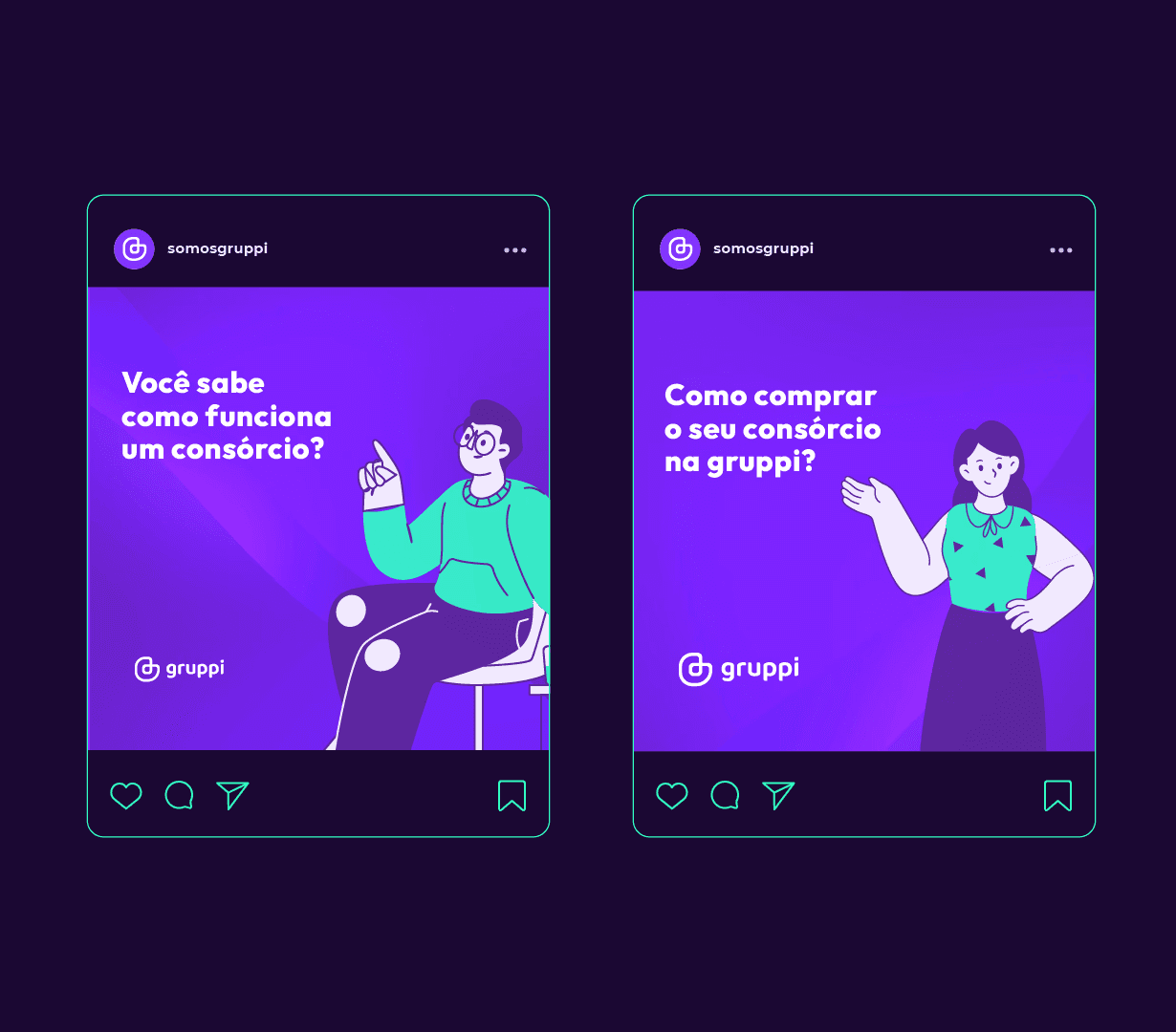
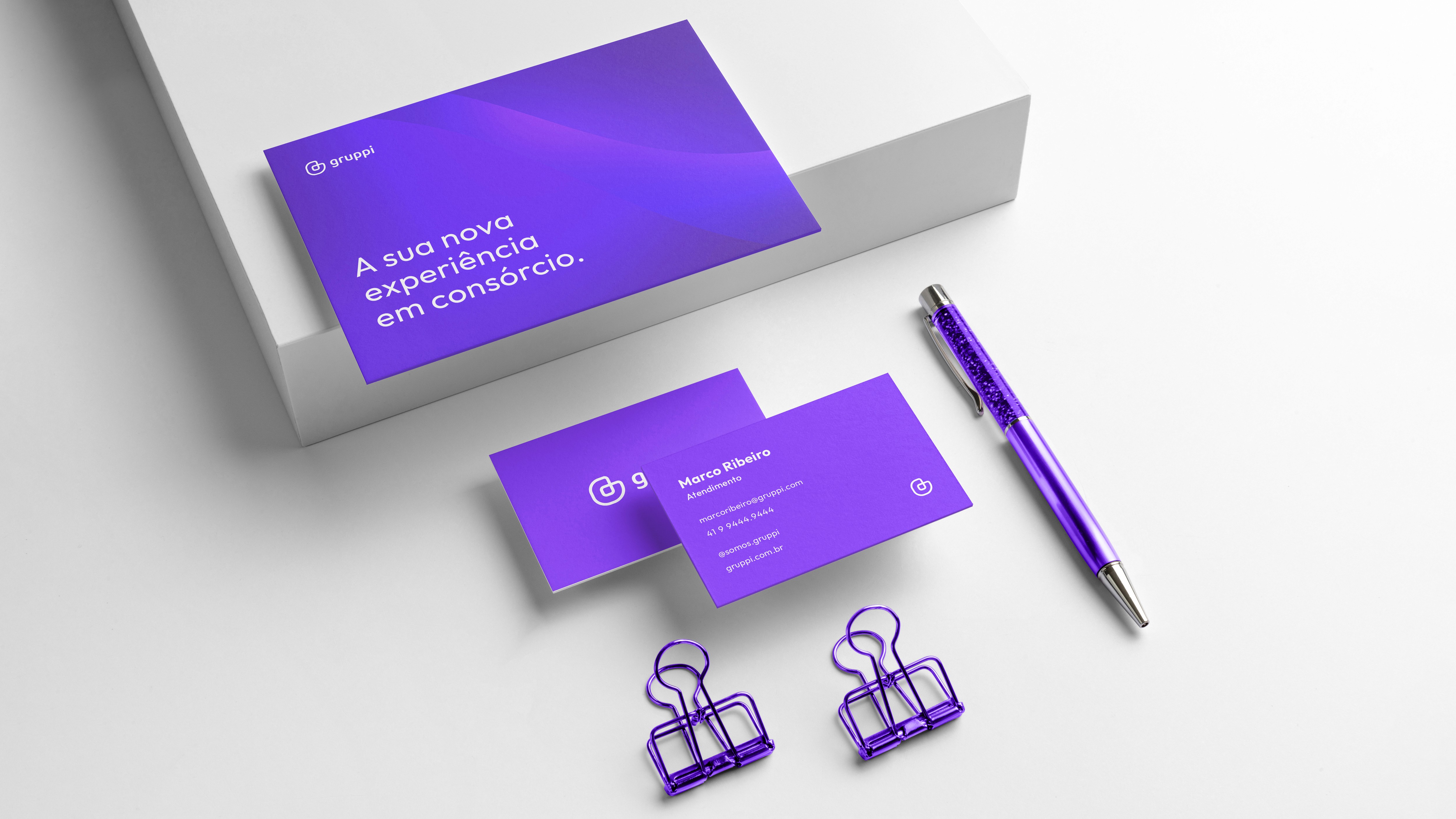
Gruppi is a 100% digital consortium. Its main objective is to bring the consortium in a more transparent, agile and personalized way for a young, modern and autonomous audience. Customer satisfaction throughout the entire process during the contracting of the service is essential for the company, as it seeks to become a reference in the consortium market.
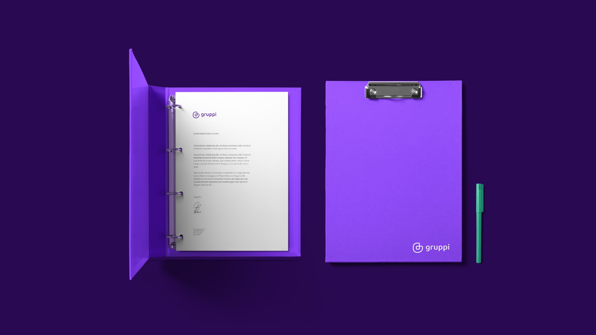
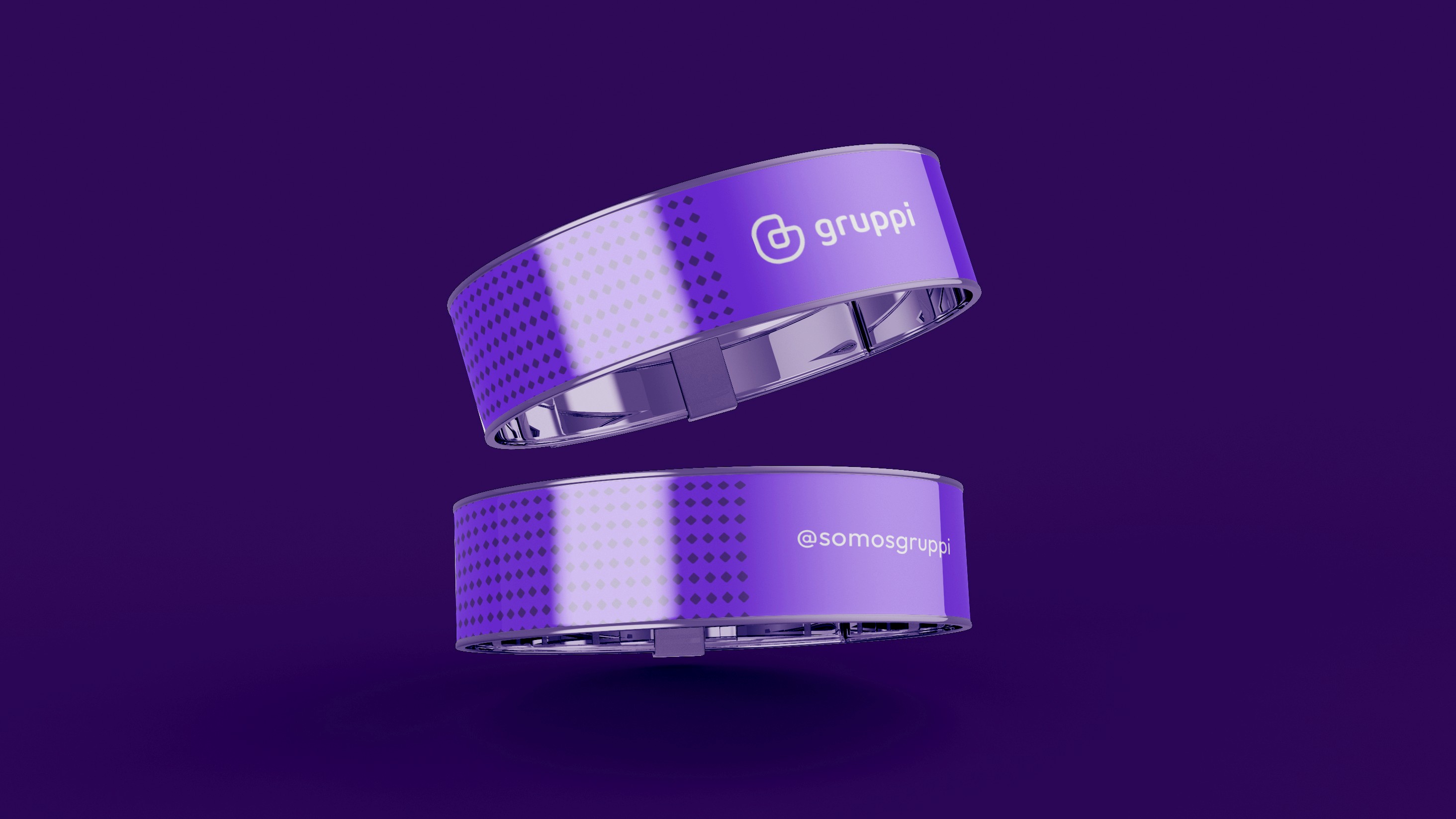
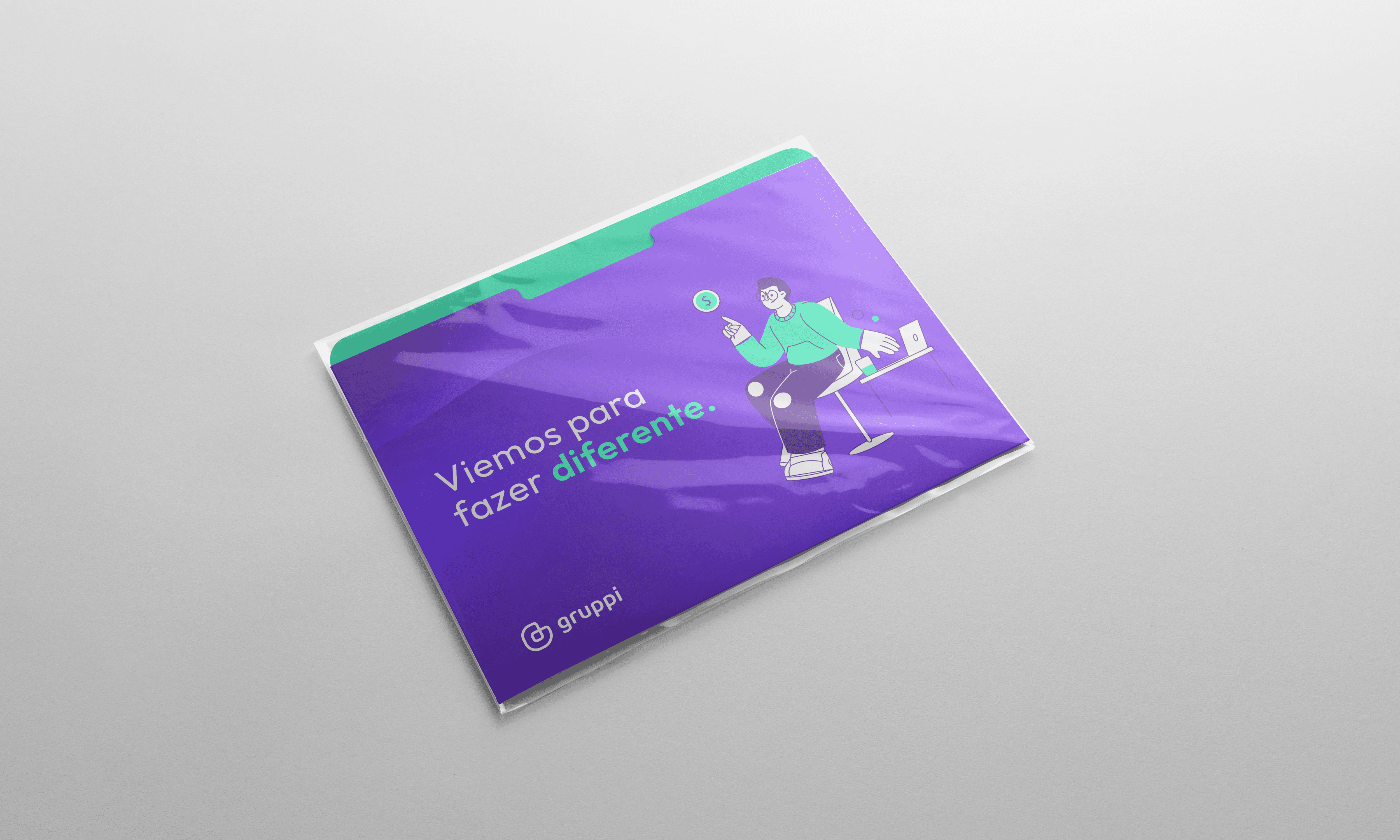
The choices made in the visual identity were based on the younger target audience and the great movement involving banks and fully digital online payment services. The choice of colors, iconography and illustrations were composed with the aim of provoking curiosity and attraction on the part of users.
In the construction of the symbol, the brand's initial was used as the main structure, followed by a junction between the ends to represent the union, bond and sense of community between the consortium members.
Gruppi is a 100% digital consortium. Its main objective is to bring the consortium in a more transparent, agile and personalized way for a young, modern and autonomous audience. Customer satisfaction throughout the entire process during the contracting of the service is essential for the company, as it seeks to become a reference in the consortium market.
The choices made in the visual identity were based on the younger target audience and the great movement involving banks and fully digital online payment services. The choice of colors, iconography and illustrations were composed with the aim of provoking curiosity and attraction on the part of users.
In the construction of the symbol, the brand's initial was used as the main structure, followed by a junction between the ends to represent the union, bond and sense of community between the consortium members.


Let's make your brand stronger?
Let's make your brand stronger?
Discover how the studio's consulting can help
your business grow and earn more
Discover how the studio's consulting can help
your business grow and earn more
Discover how the studio's consulting can help
your business grow and earn more
Discover how the studio's consulting can help
your business grow and earn more